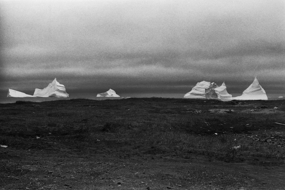
Ville Kumpulainen
Artist Feature
Every week an artist is featured whose single image was published by Der Greif. The Feature shows the image in the original context of the series.
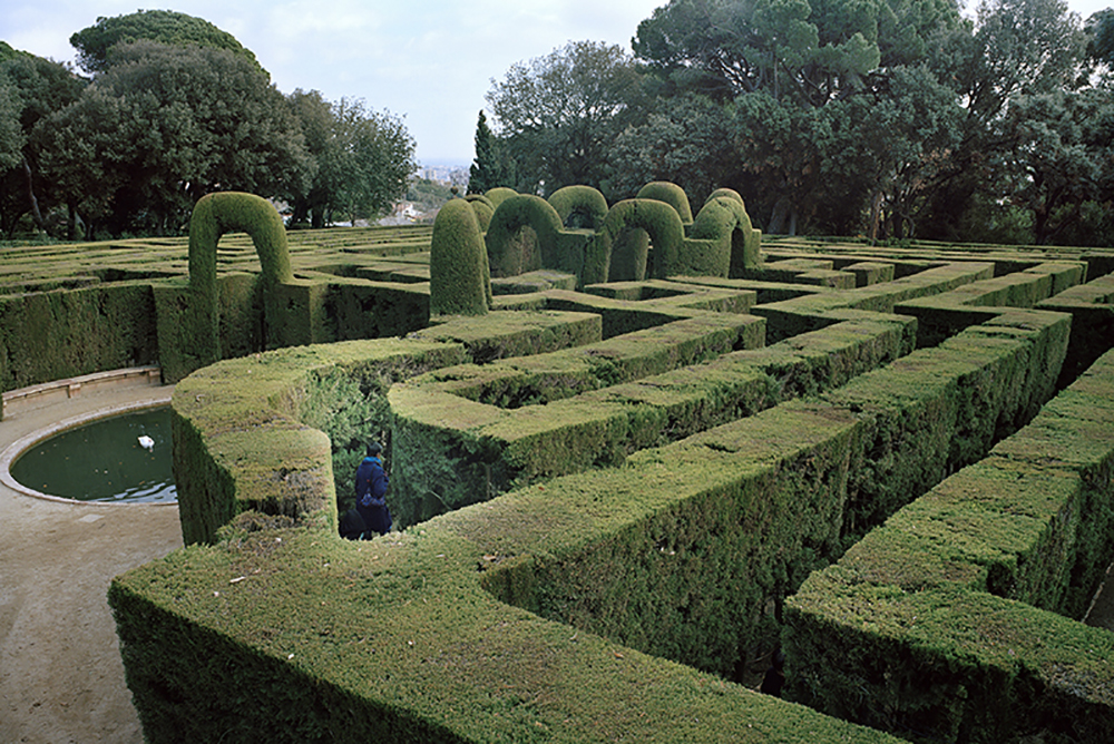
1/28 maze
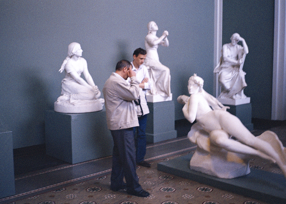
2/28 MenInMuseum
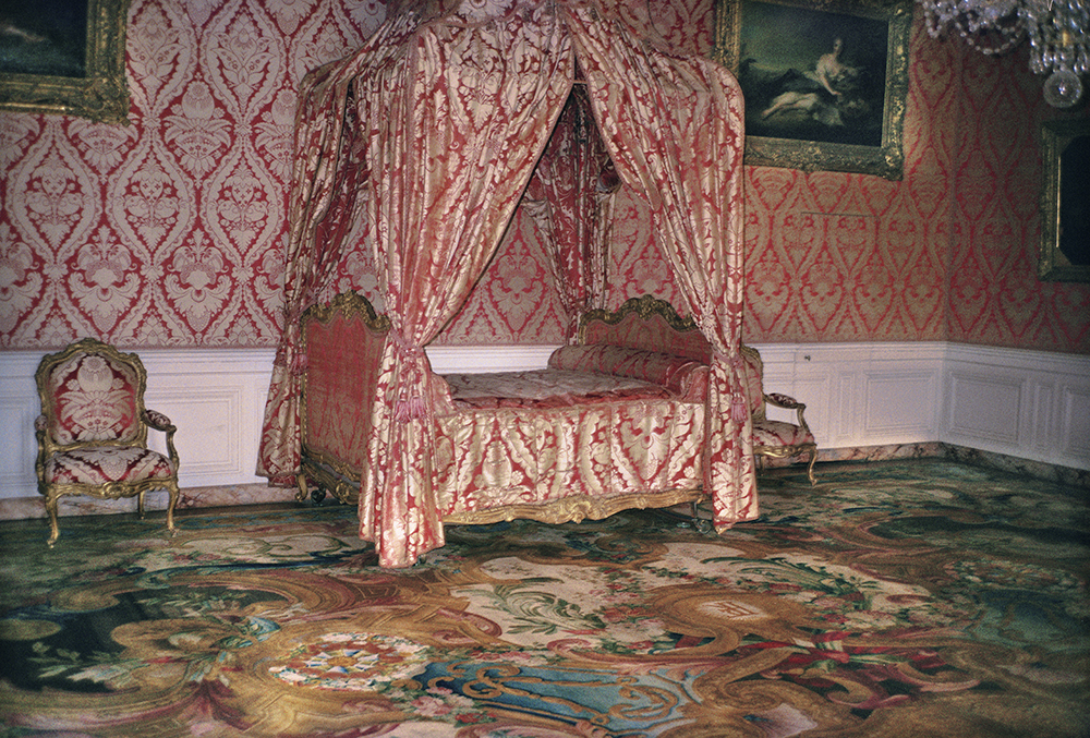
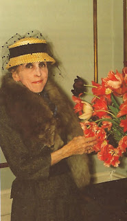
3/28 Marieantoinette
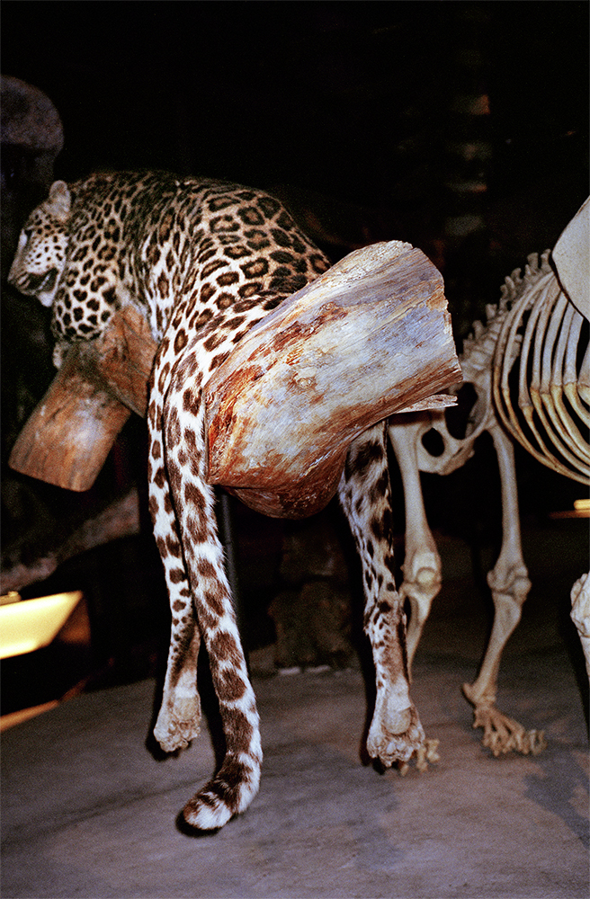
4/28 leopard
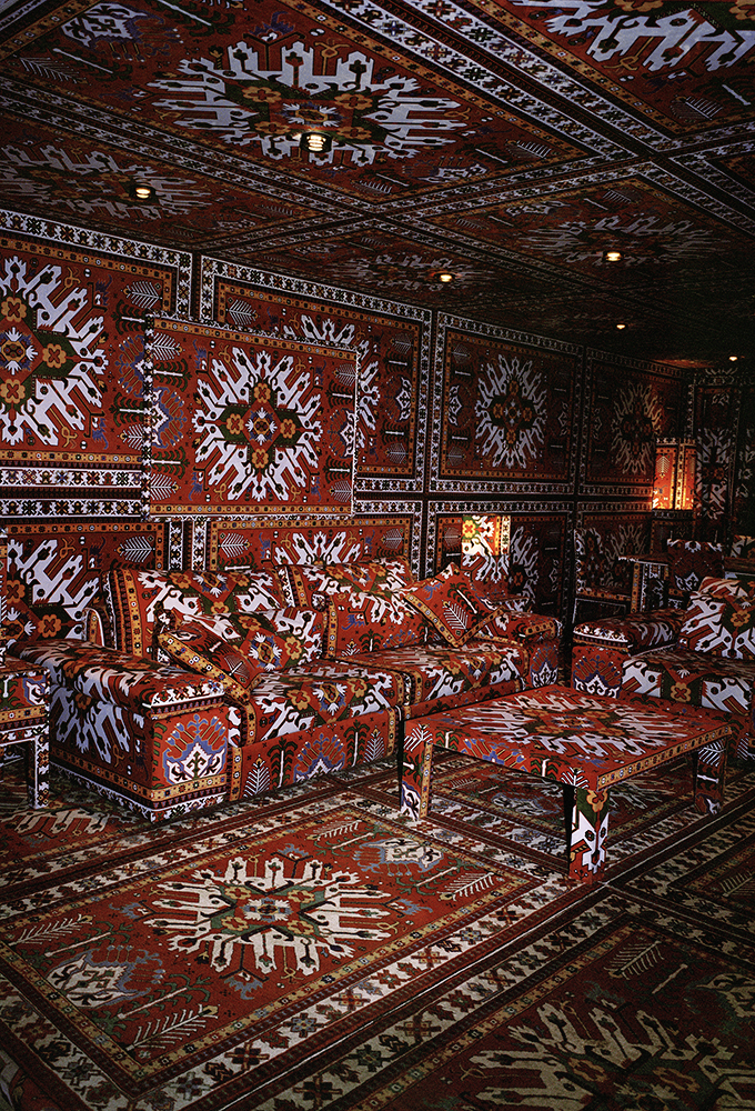
5/28 TheDen 1
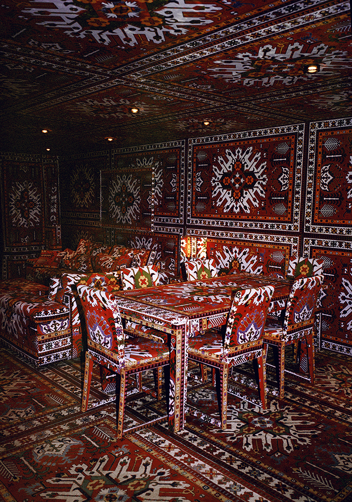
6/28 TheDen 2
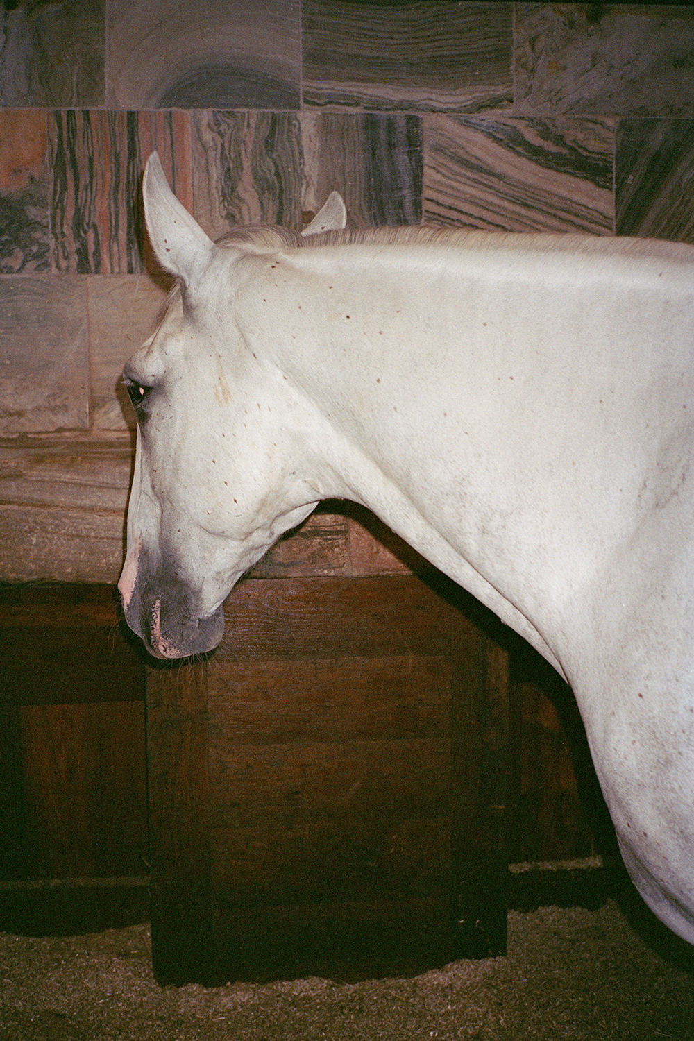
7/28 RoyalHorse
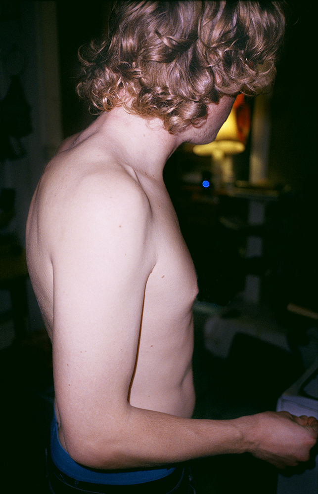
8/28 Curls
9/28 maze02
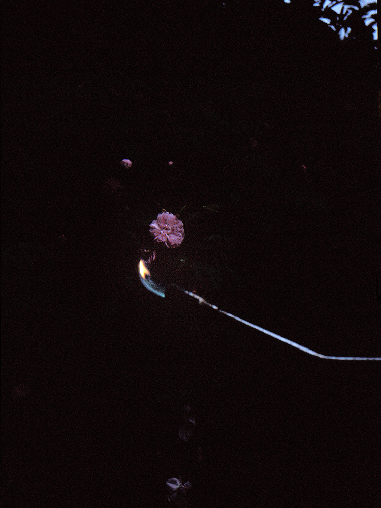
10/28 fireFlower
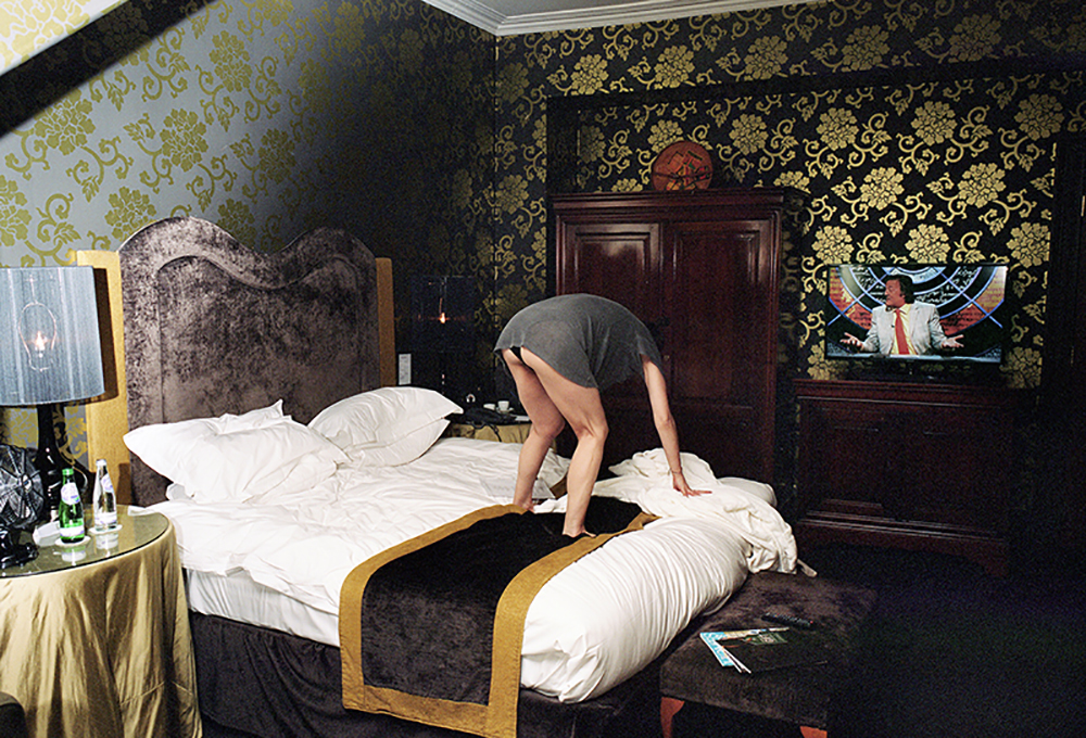
11/28 SusanOnBed
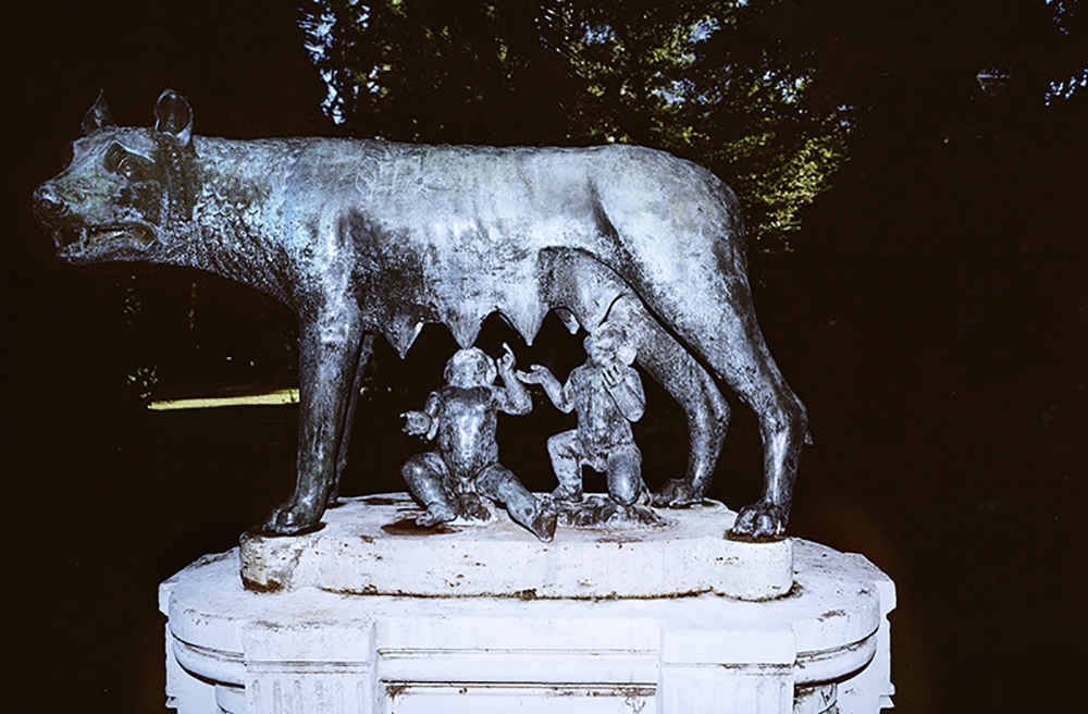
12/28 Roma
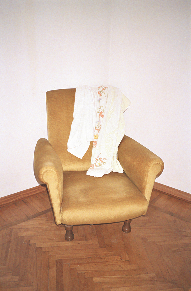
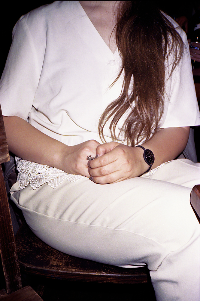
13/28 chair
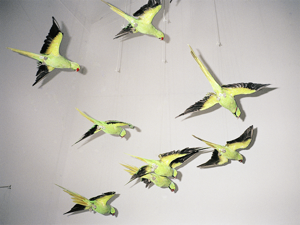
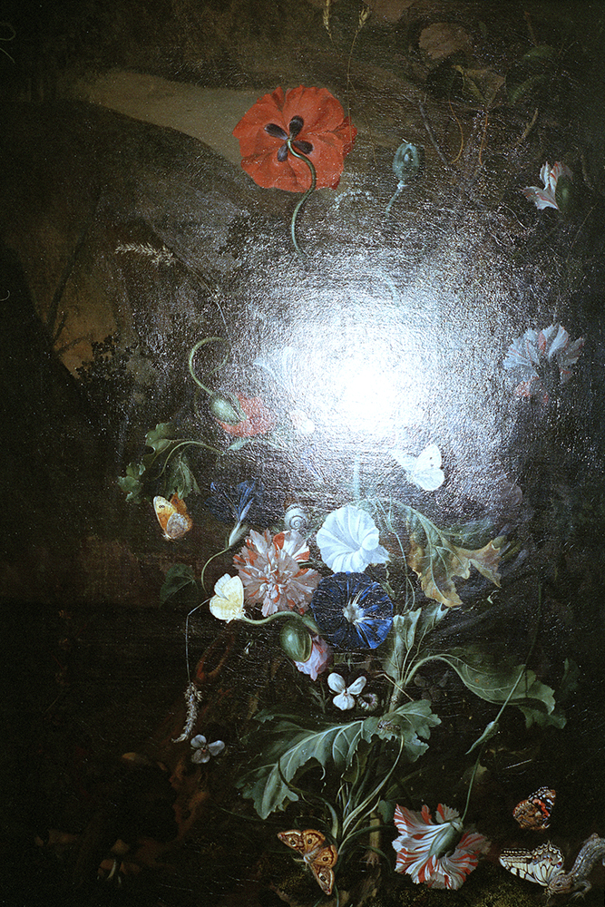
14/28 Birds
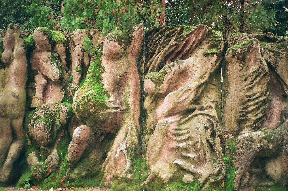
15/28 wall
16/28 Kelvingrove
17/28 Florrie
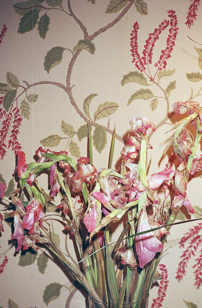
18/28 Wallpaper

19/28 ladyFlowers
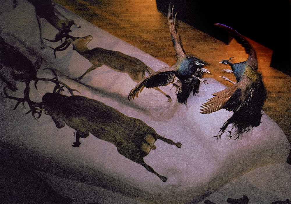
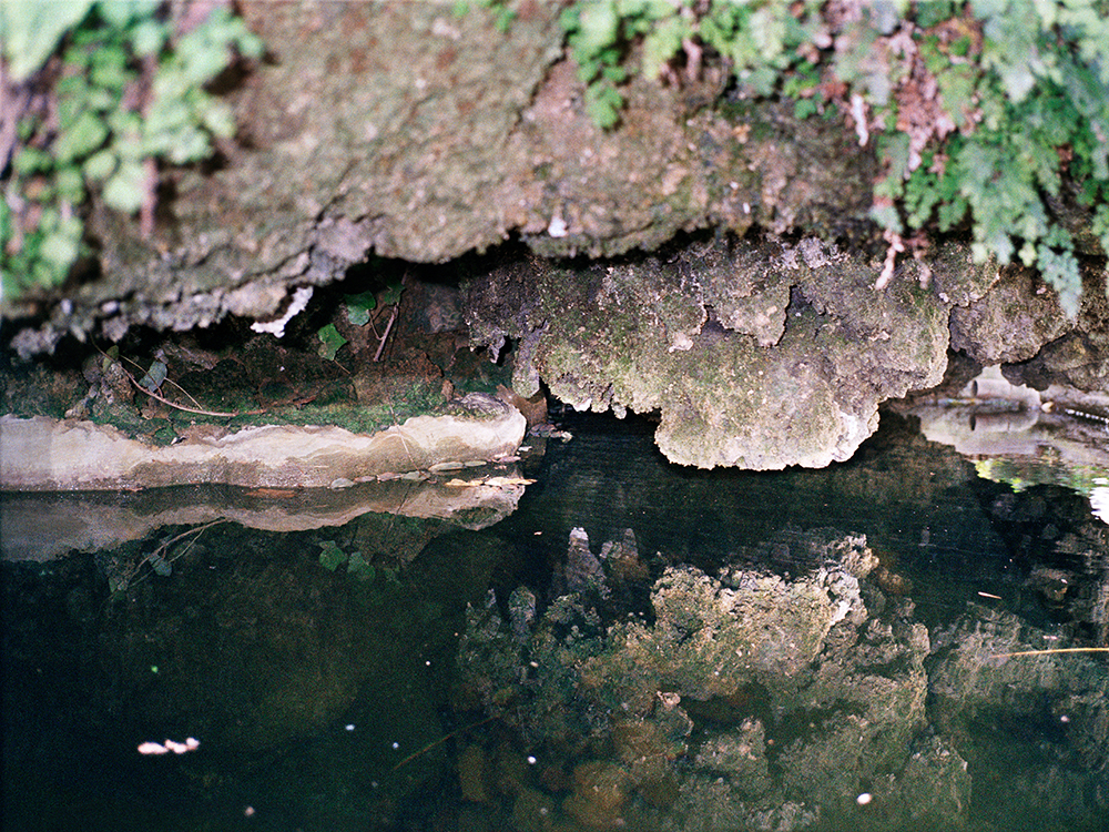
20/28 Animals
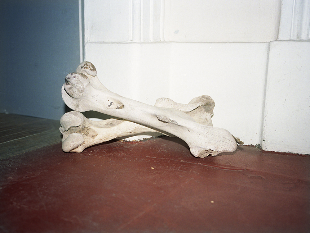
21/28 Bones
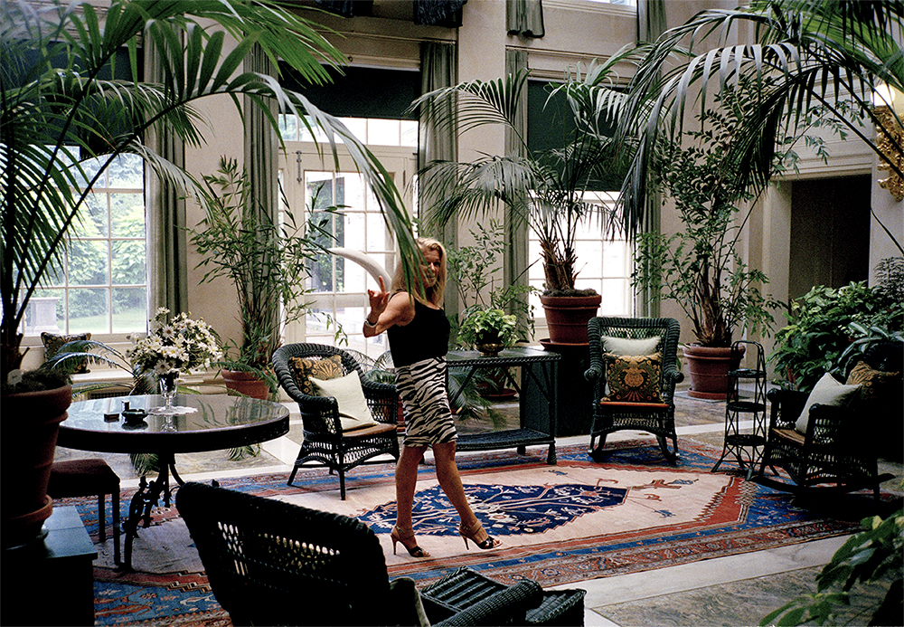
22/28 ZebraLady
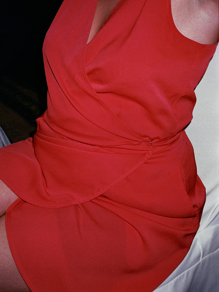
23/28 red
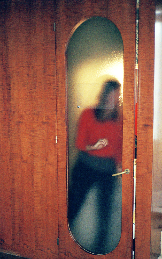
24/28 Reflection
25/28 AljaInWhite
26/28 Head
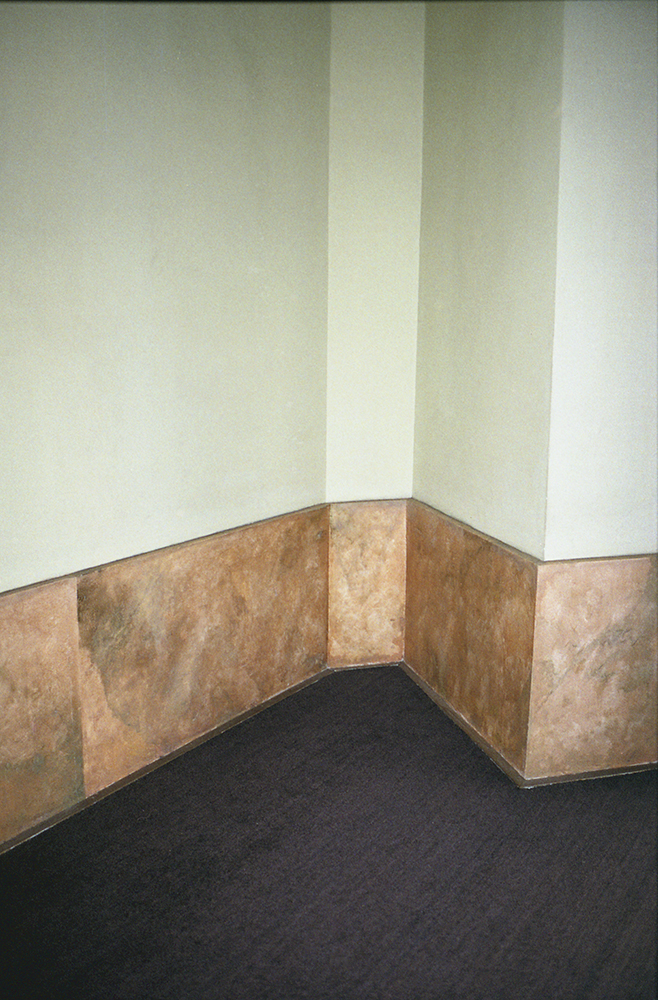
27/28 wall
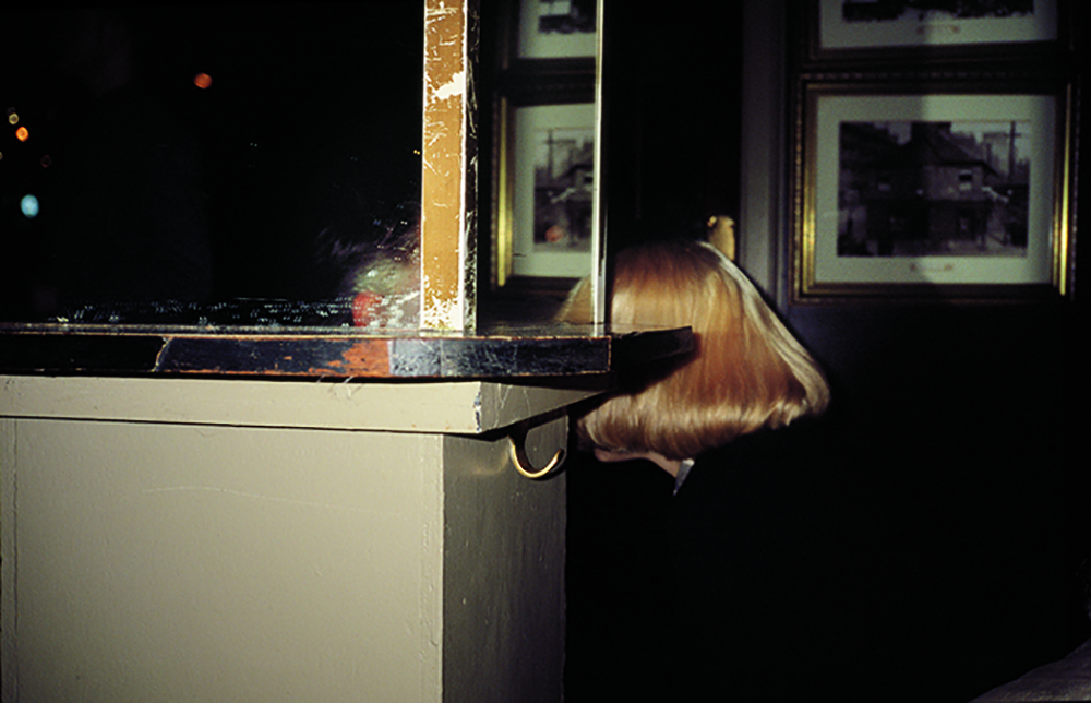
28/28 TheBelle
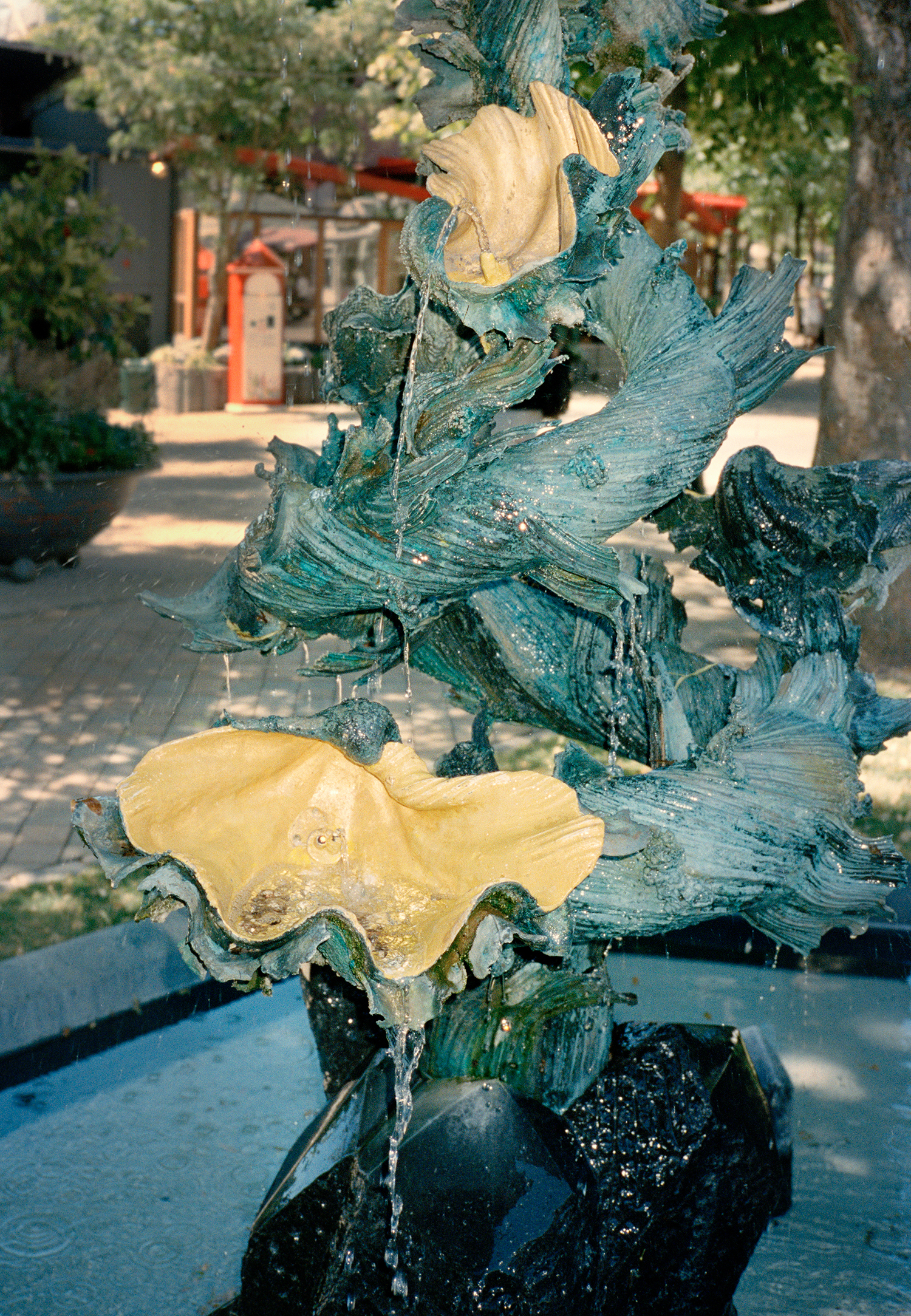
Tine Bek - Barok
Jul 04, 2018
The series attempts to look at gestures, and the hunt for perfection in our exterior surroundings, hereby trying to understand an imperfection which is inevitable and its many facets. Desire, pleasure and sorrow is the main affect that is utilised in an ever-growing body of work which turns and changes the viewer’s perception in an unexpected way. Every image is a fold that allows multiple readings and changes the conditions of looking through visual material that is as visceral as it is tactile.
Barok is an investigation into how we interact with the spaces around us, and the effects this has on the individual. Hereby looking at the human condition when confronted with specific forms, shapes and textures. Barok takes the baroque as a main inspiration, not just as a period within architecture or art, but more so as an expression of a certain philosophy. The photographs are all individual pieces, yet as a whole, they create this expression of the Baroque, containing an explosion of decorative decadence, richness of colour, materiality and form.
Artist Blog
The blog of Der Greif is written entirely by the artists who have been invited to doing an Artist-Feature. Every week, we have a different author.
Published in:
»Der Greif #11«
The Book As a Method
Jul 10, 2018 - Tine Bek
To round off I would like to share some links for publishers and focus on the book as a method of sharing work.
Most of my work start as a book layout and my editing often looks at how the images would react to each other when being seen in a sequence.
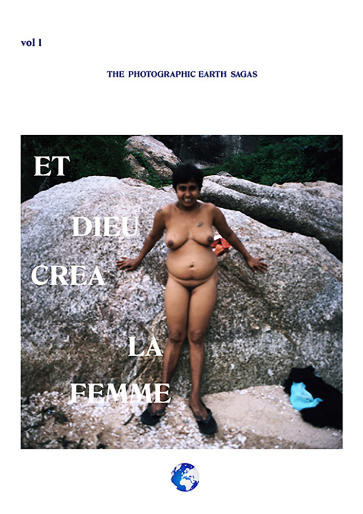
in 2015 I started a small publishing house called Earth Saga Press,
THE PHOTOGRAPHIC EARTH SAGAS are, as the title might give away, stories or rather snippets of tales about very grand themes. For me personally these publications are all experiments where I test out the boundaries and possibilities within photography as a medium. How does the relationship between images and text change the flow of the pages? How will these relations evolve when translated onto the gallery wall? And what role does history play in the way we choose to perceive images?
Looking at not only the representation of gender but the concept of it. Hereby shaping a conceptual hybrid, transgressing conversations about identity and universality, existentialism and particularism.
Vol. 1. ‘ET DIEU CREA LA FEMME’2015
Vol. 2. ‘AGE OF MAN’ 2015
‘September Seconds’ 2016
Vol. 3. ‘LETTERS FROM EARTH’ 2017
Artist featured in publications:
Jessica Susan Higgins, Flavia Schuster, Sara Skorgan Teigen, Sarah Michelle Riisager, Guadalupe Miles, Lorena Guillen Vaschetti, Jasmine Bakalarz, Mette Juul, Alexandra Giarraputo, Hannan Jones, Paula Nimand Duva, Tine Bek, Susan Boyle and Nina Bacos, Sarah Forrest, Allen Frame, Birk Høgsted Thomassen, Mads Holm, Isabella Shields, Marc Allen, Christian Klintholm, Scott Caruth, Patrick Tsai, Alexander Peitersen, Michail Mersinis, Wolfgang Zurborn, Jesper Fabricious, Jennifer Lauren Martin, Thankful Hovey, Estelle Fournier, Nina Mouritz, Mia Rewitz, Marco Dirr, Conor Baird and Alexander Arnild Peitersen.
A publishing house to keep an eye on is Konnotation Publishing.
Konnotation is an art publishing and creative company, specializing in printed matter for artists, collaborating on exhibition catalogues and facilitating a platform for cross cultural endeavors. Konnotation functions as a vehicle for promoting, editing and creating art related projects.
Konnotation is run by Emilie Nilsson and Nina Mouritzen.
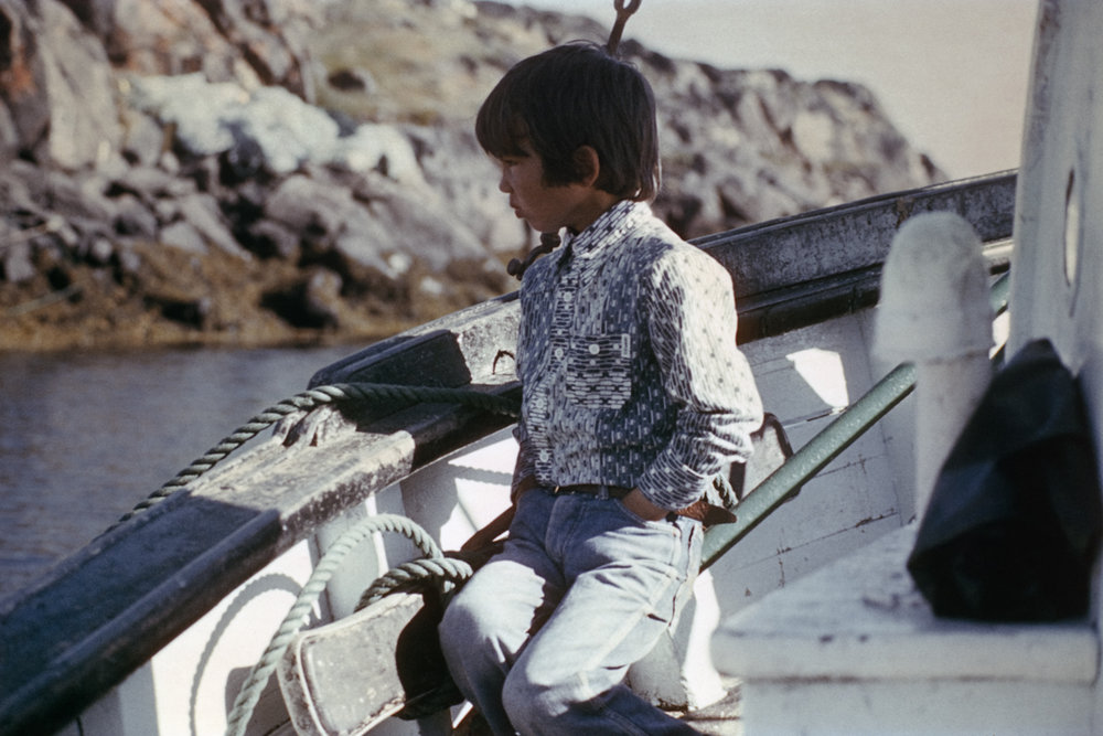
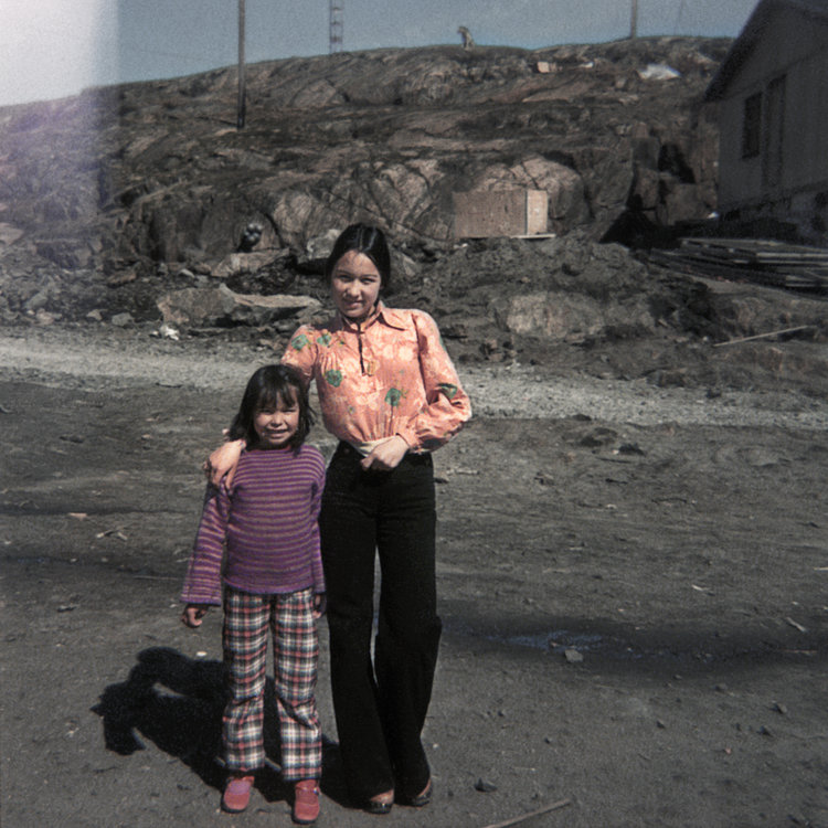
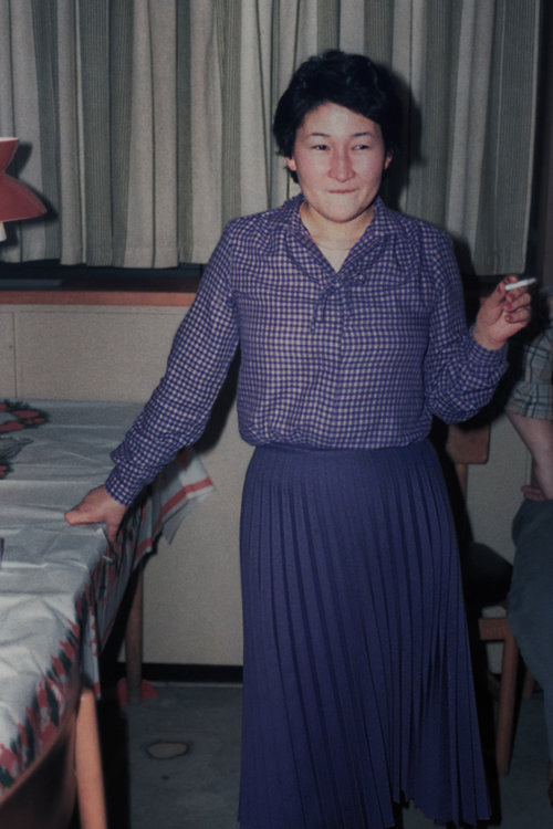
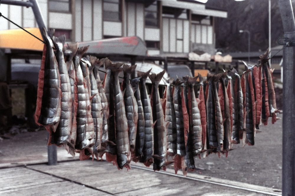
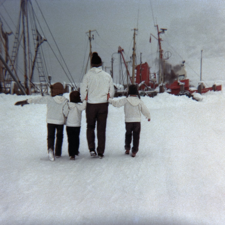
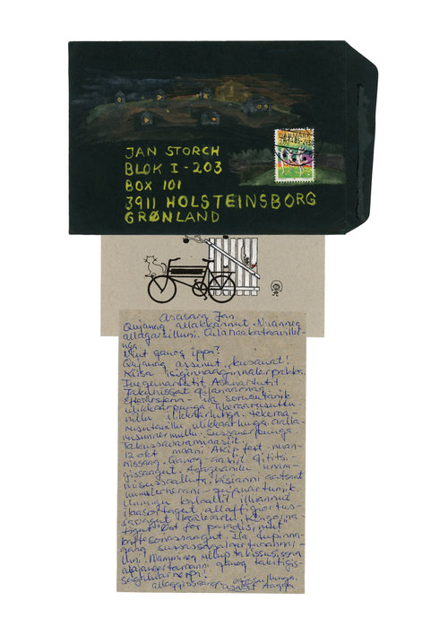
Their next publication Porcelain Souls is coming out in August and is featuring work from Inuuteq Storch.
Inuuteq describes his project:
This book is the first book of a bigger project related to the history that I posses in my soul and dna, Greenlandic history.
I realized that the written history of Greenland is mostly written by foreigners and most of the photos taken back then were taken by foreigners.
Theoretically, with no other questions, we are receiving the correct information, but like in chemistry, theory and practical exercises will never give the same information, because every situation has a way to loose or gain information in a way that we can not control. This situation is like that too, we can not control another persons fascination and focus when writing about Greenland, we can not tell how the language boundaries changed the relation of what is going on and what is written.
We can not control the photographers view and idea what should be included in the photos. So I came up with the idea that I want to minimize those fouls by collecting photos from families, friends, locals and show their everyday life. Let their own history become a reachable Greenlandic history in a book form.
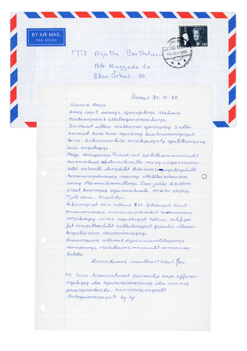
This book is a collection of photos that my parents took when they were young and their letters to each other when they lived in different places (Father in Sisimiut, Greenland and mother in Aarhus, Denmark).
Photos are from a specific time in greenlandic history, between end of 60s to the beginning of 80s. Letters are from mid 80s.
This book contains portraits and letters, and those together will show different perspectives of their lives. The environment they lived in and the personal relationship that they had.
To finish off I will just quickly return to giving some travel advice, and let you knwo that if you are interested in Artist books and happen to pass by Copenhagen a must visit is Bladr which is located in Copenhagen.
Bladr (Danish for ’turn the page’) is a platform for the exploration, distribution, and appreciation of artists’ books, which aims to increase the visibility of the field.
Morphing between different tactile and artistic manifestations such as drawing, photography, collage, text, graphics, etc., an artist’s book is a piece of art in its own right; an artwork taking the shape of a book. By exploring the artist’s book and how it is interlaced with various art disciplines, Bladr seeks to facilitate the potential of the art form.
The platform assumes various shapes by being a bookstore and an exhibition place, as well as a space for workshops, screenings, performances, book launches, talks, and other events.
Bladr is a non-profit project run by a group of artists, photographers, graphic designers, and critics, all of which have been working with artists’ books in different constellations. Bladr was established during the winter of 2017, and opened in its present form in Griffenfeldsgade 27 in February 2018.
Last but definitely not least I have recently been introduced to the work of Danish publisher Disko Bay.
Disko Bay is a new photobook publisher based in Copenhagen. We focus exclusively on talented photographers and photo artistic work.
We dedicate ourself to the highest quality through the best printing methods and binding. Photography in book form is currently experiencing international awareness and recognition. Disko Bay will be the first Danish publisher to focus exclusively on this art genre.
images by M.h. Frøslev
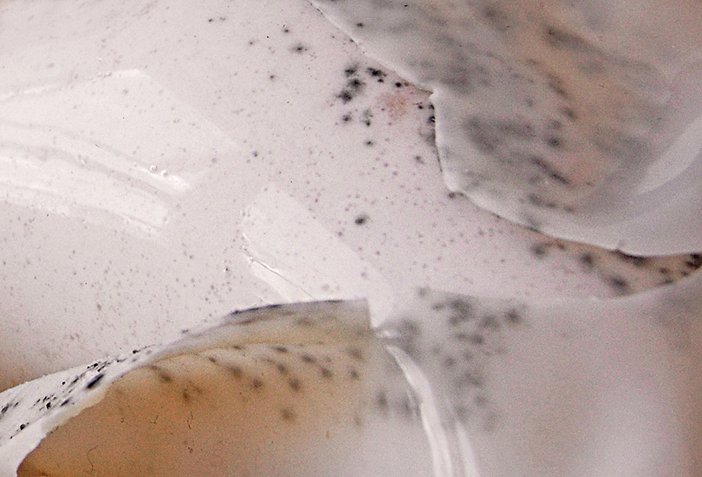

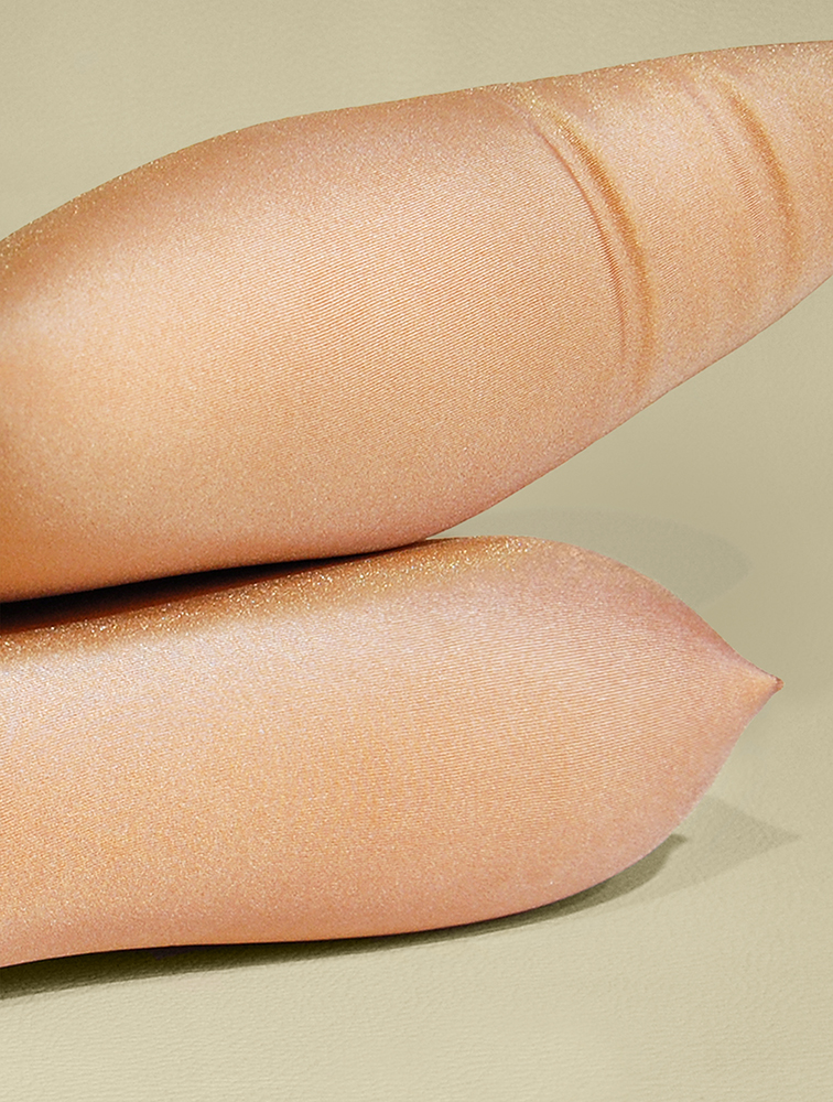
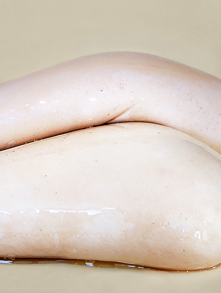
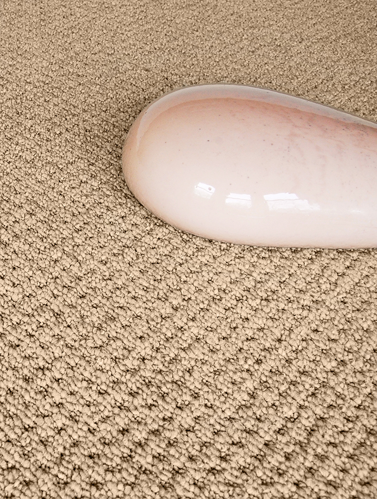

Foreign Fauna
Jul 09, 2018 - Tine Bek
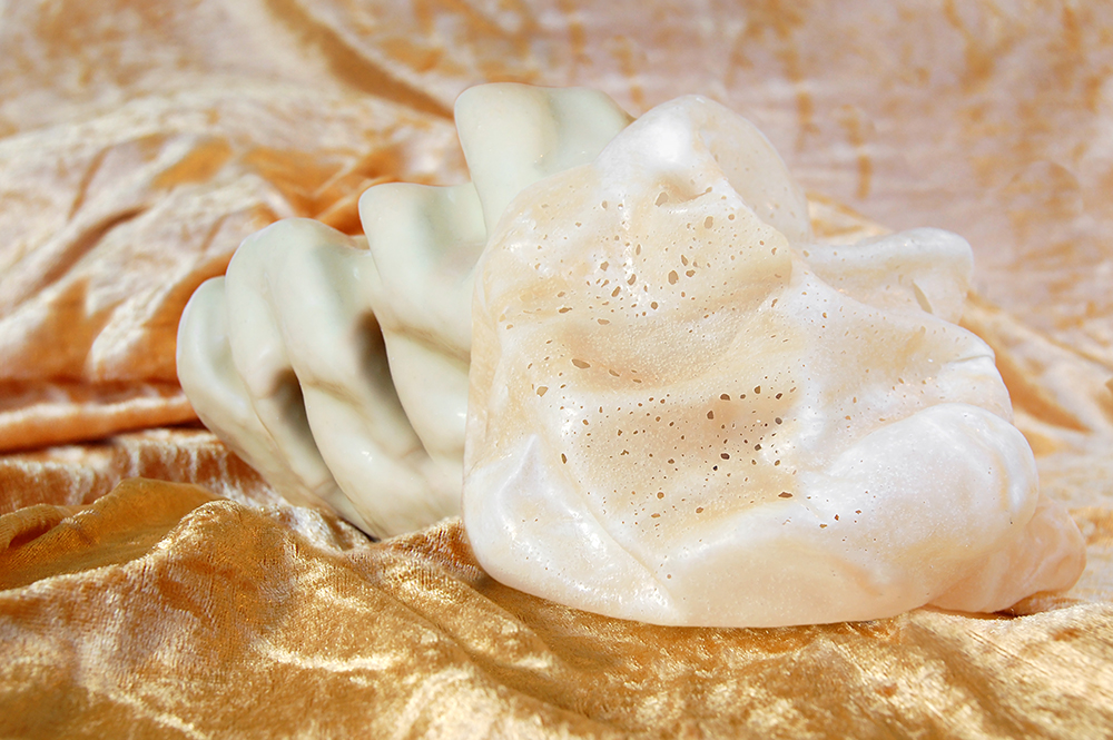
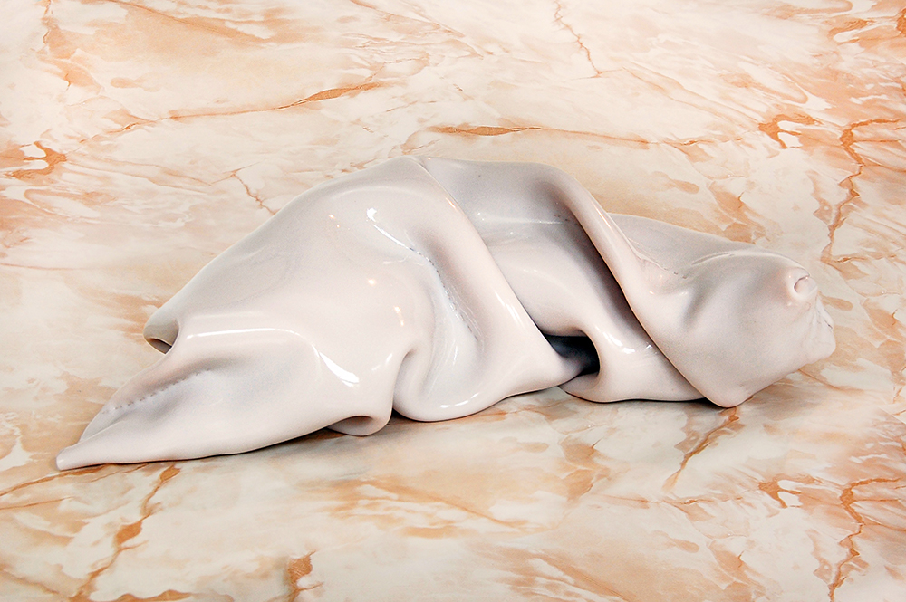
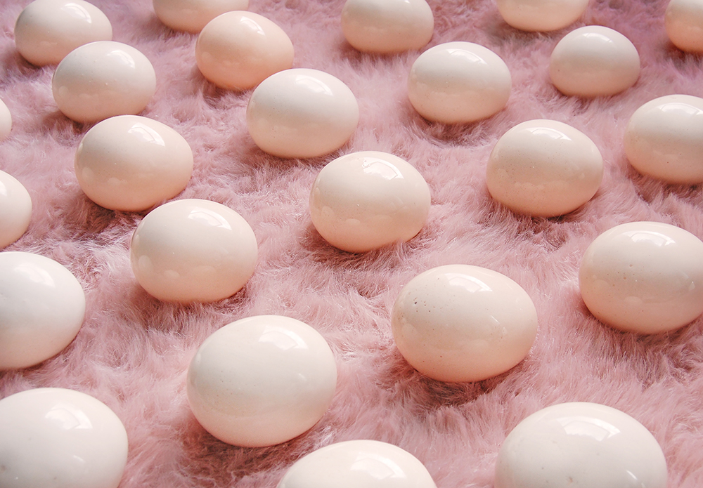
Im very happy to share Hanne Lillee’s work with you. Hanne and I have been working on a collaboration where we investigate common interests try to link the visual language of our projects to somehow tell a new story.
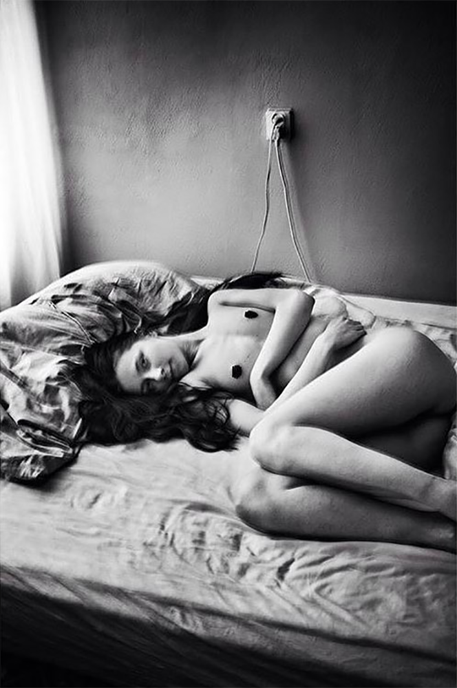
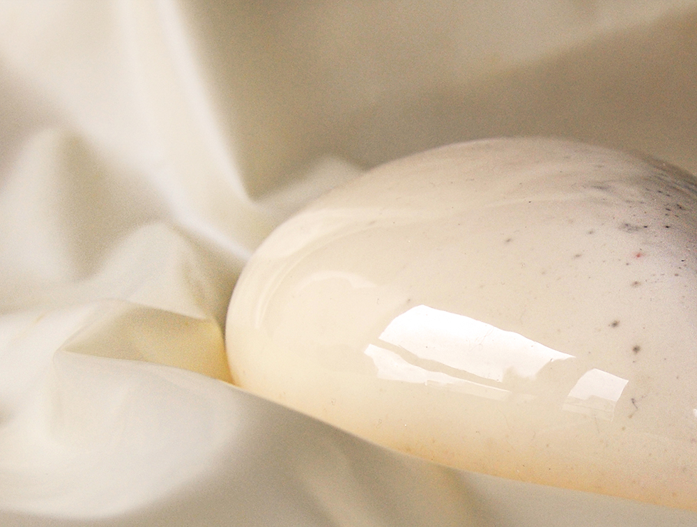
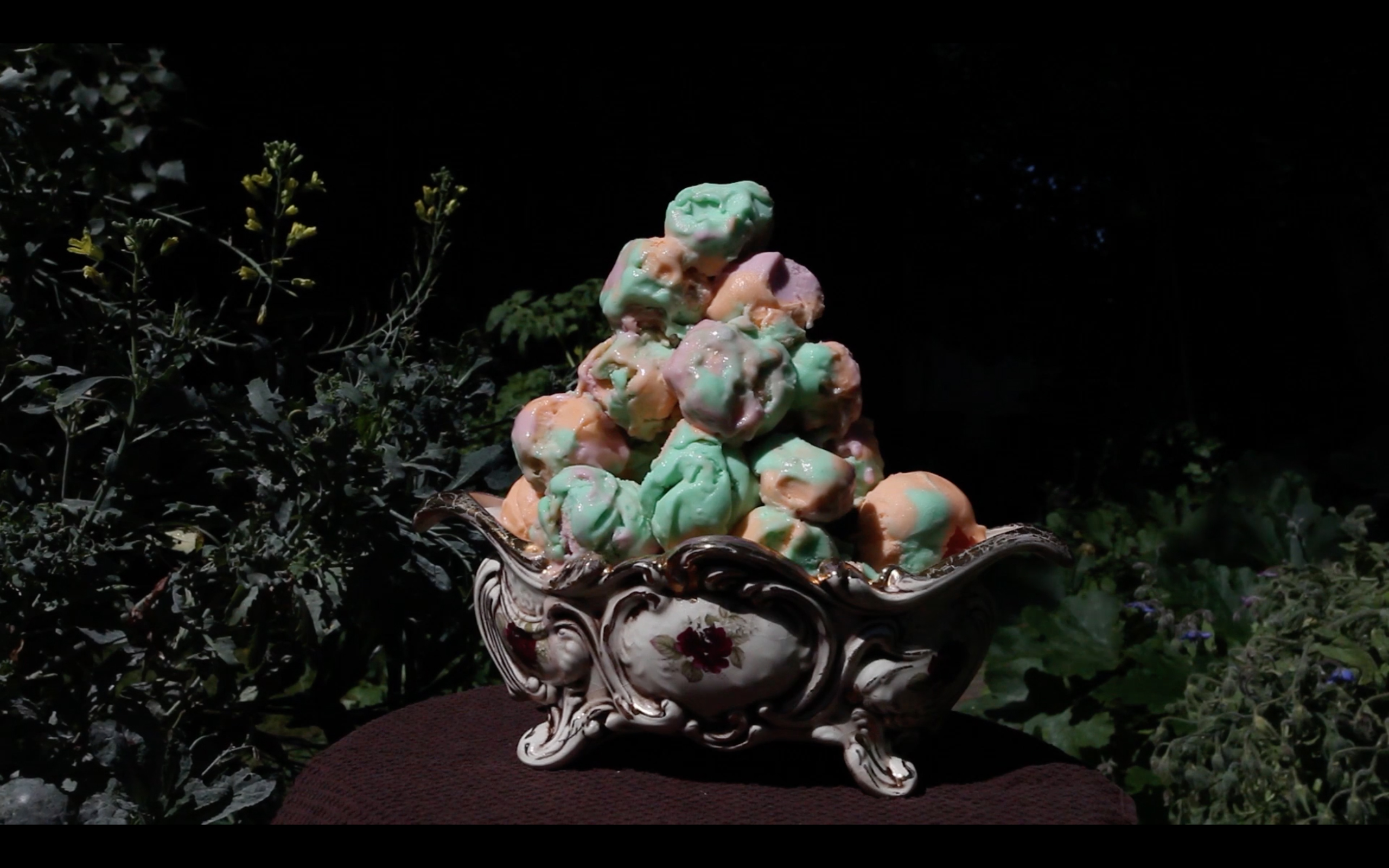
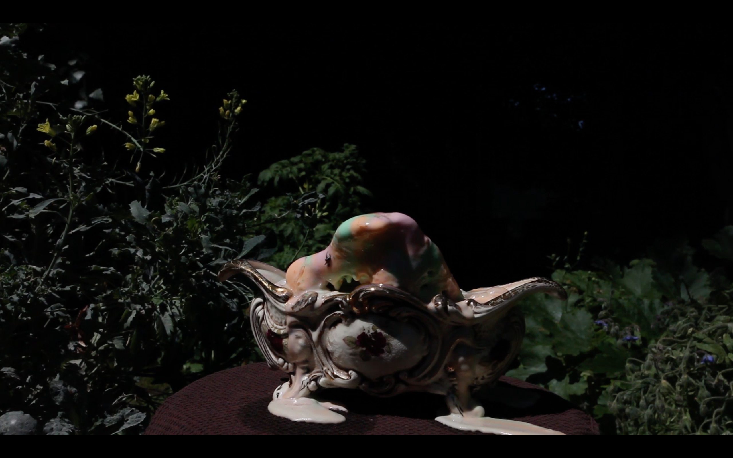
Hannes work somehow reminds me both of something familiar yet oddly strange at the same time. The objects portrayed in her series Foreign Fauna are captured in such a way that they seem as if they all have their own particular traits and personalities.
Hanne Lillee is an artist based in Glasgow, originally from Norway. Her work involves the processes of sculpture making and photography, whereby the boundaries between object and subject are blurred. Looking at the reductive perceptions of femininity and nature, she explore themes of desire, anxiety, fetishisation and procreation.
The body of work titled Foreign Fauna display alienating forms in amongst an environment of know domestic textures and materials. These biomorphic shapes suggests something living, however fragmented, deformed and distorted, manifested through allusions to bodily fluids, parts or skin. This narrative strangeness evokes a recollection entangled with both attraction and repulsion simultaneously, as it imitates something mutual as well as intimate.
see www.hannelillee.com for more details.

Karen Blixen
Jul 07, 2018 - Tine Bek
As a part of my project ‘The Vulgarity of Being Three-Dimensional’
I was very inspired and overwhelmed by the writing of Karen Blixen.
The first of her writing I read was Babette’s Feast, which tells the story of a marvellous meal that changes people’s perception of life in a small village. I won’t go more into the actual story because it is well worth a read, however I will share this trailer with you, which is an adaptation of Babette’s feast from 1987 by Gabriel Axel.
Baroness Karen Christenze von Blixen-Finecke (born Dinesen; 17 April 1885 – 7 September 1962) was a Danish author who wrote works in Danish and English. She is best known under her pen names Isak Dinesen, used in English-speaking countries, and Tania Blixen, used in German-speaking countries. She also published works using the aliases Osceola and Pierre Andrézel.
Fascinated by not only the actual writing, descriptions of people, humour and melancholy, what at first glance interested me by Blixen’s writing was her many pseudo names, and aliases. In an interview in Danish newspaper Politiken in 1934 she explains how she was inspired by her father, whom also wrote under pseudonym.
“He had written numerous things in his own name, Wilhelm Dinesen, and he of course took full responsibility for that. But in the letters from the hunt he expressed himself freely, gave his imagination free rein or criticised men in public positions. He didn’t want people asking: Do you really mean that, Captain Dinesen, or have you, yourself, experienced that story we read in the newspaper this morning.”
This balance between truth and fiction, gender, authorship and identity is something i found very relevant especially today, and it lead me on to read more of Blixen’s stories and novels. She wrote both in English and in Danish and would often translate the work herself. This reworking of stories and way of playing with language is something I find really important in her work. Having lived away from my home country for almost a decade I am often stuck in this language limbo where I actually don’t always know which language I feel the most comfortable in.
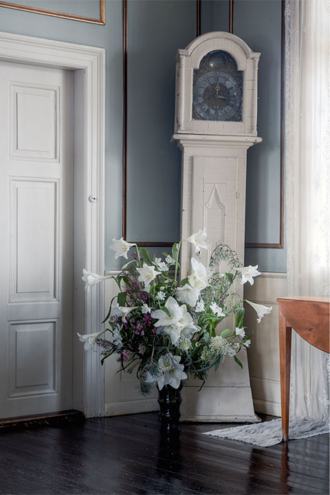
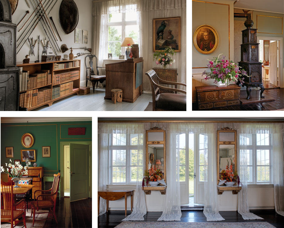
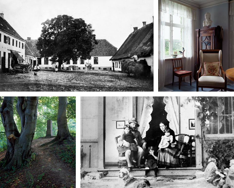
However, when I do read in Danish it does feel like finding an old familiar friend. To found out more about Blixen there are plenty of books to read and if you are ever in Denmark it is an absolute must to visit the Karen Blixen Museum. The museum is a true gem hidden away just outside of Copenhagen. They have changing exhibitions, alongside a permanent showcasing of some of Blixen’s personal things and her house, and the best part is her garden which is a perfect place to relax. Not that I’m trying to turn this into a travel blog, but thought it was worth a mention:)
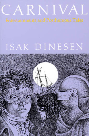
So as a result of some of my research I created the project The Vulgarity of Being Three-Dimensional, which is still ongoing. One of the first pieces was a video made during a residency in Portland, where I by accident found a first edition of Blixen’s book Carnival which is a collection of short stories.
The original film is 54 min long, but if you would like a sneak peak there is a shorter version available here.
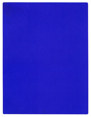
Blue as an Inspiration
Jul 06, 2018 - Tine Bek
Blue is a great colour and there are so many great blue things around. Without sounding too childish I would like this second post to be about my love for blue, the best of colours really.
Always having a soft spot for that particular colour probably came very early on since i was born by the sea and spend most of my childhood at the beach. Later on when in arts school I became more aware of the history of this brilliant colour, and with my Barok project blue became the cover colour that frames and sets the tone for the whole book.
Here are some blue facts I found on the internet and which I thought are too good to not share:
1. In ancient Rome, blue was associated with barbarians. Wearing blue was looked down on as a sign of eccentricity or mourning, and blue eyes were considered a sign of bad character or a physical deformity.
2. The uses and meanings of blue in Europe shifted sharply when it became the color of Mary’s cloak during the development of the cult of the Virgin in the twelfth century. From depictions of Mary, blue spread to other religious imagery.
3. Because of the low usage of blue in ancient Greek and Rome, researchers in the 1800s wondered if the ancient Greeks and Romans could even see the color blue. (They could.)
4. More than half of American adults today say blue is their favorite color.
These great facts are found here
Lastly I would like to share some quotes from a book by Maggie Nelson a American writer. The book is titled Bluets and includes great poems and short snippets from the writers life all dealing with or somehow relating to the idea of blue.
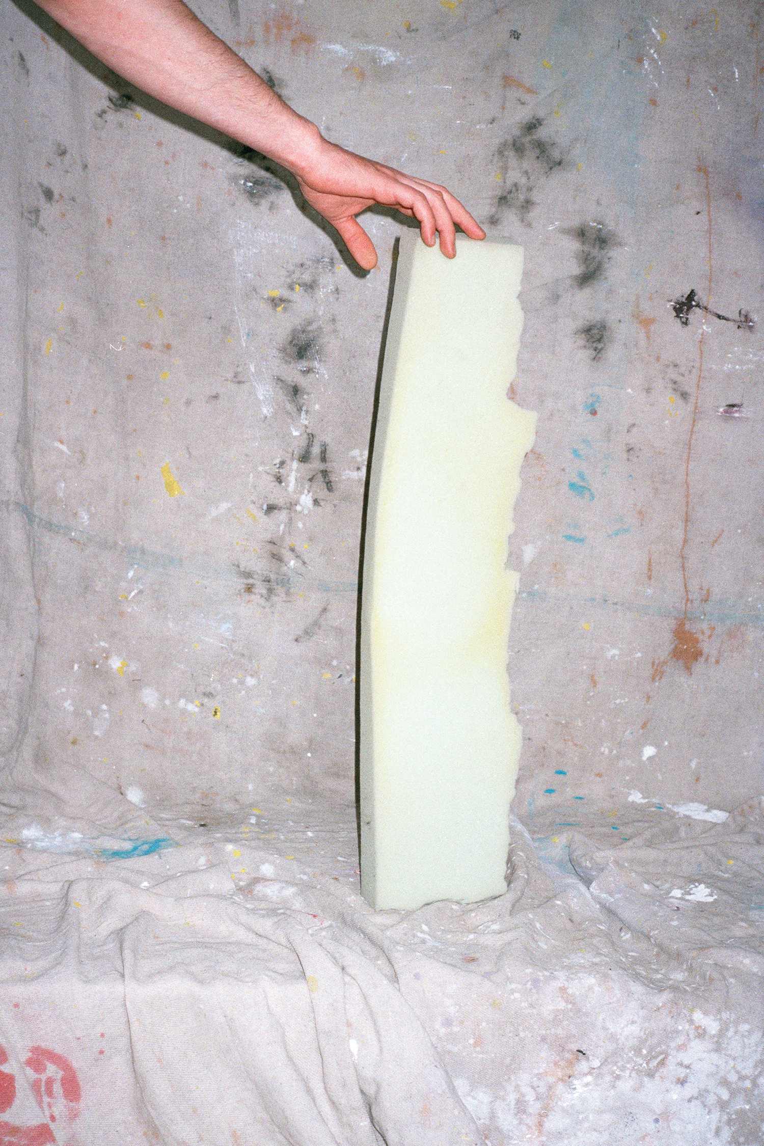
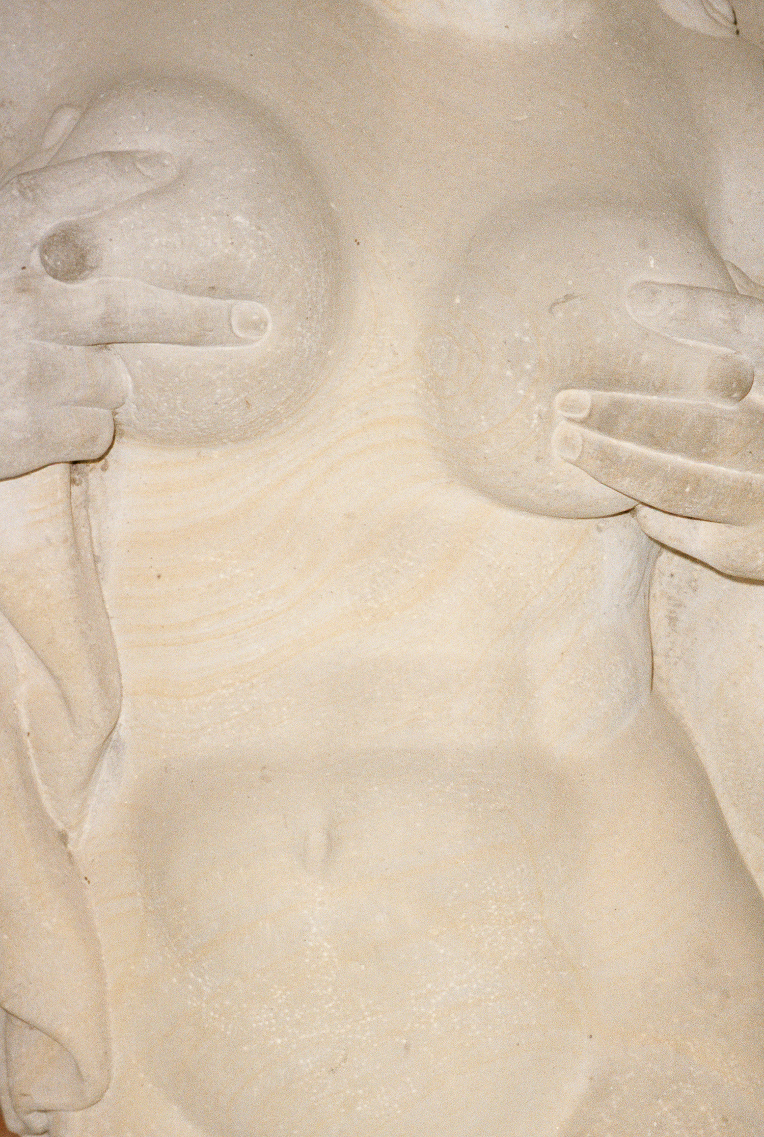

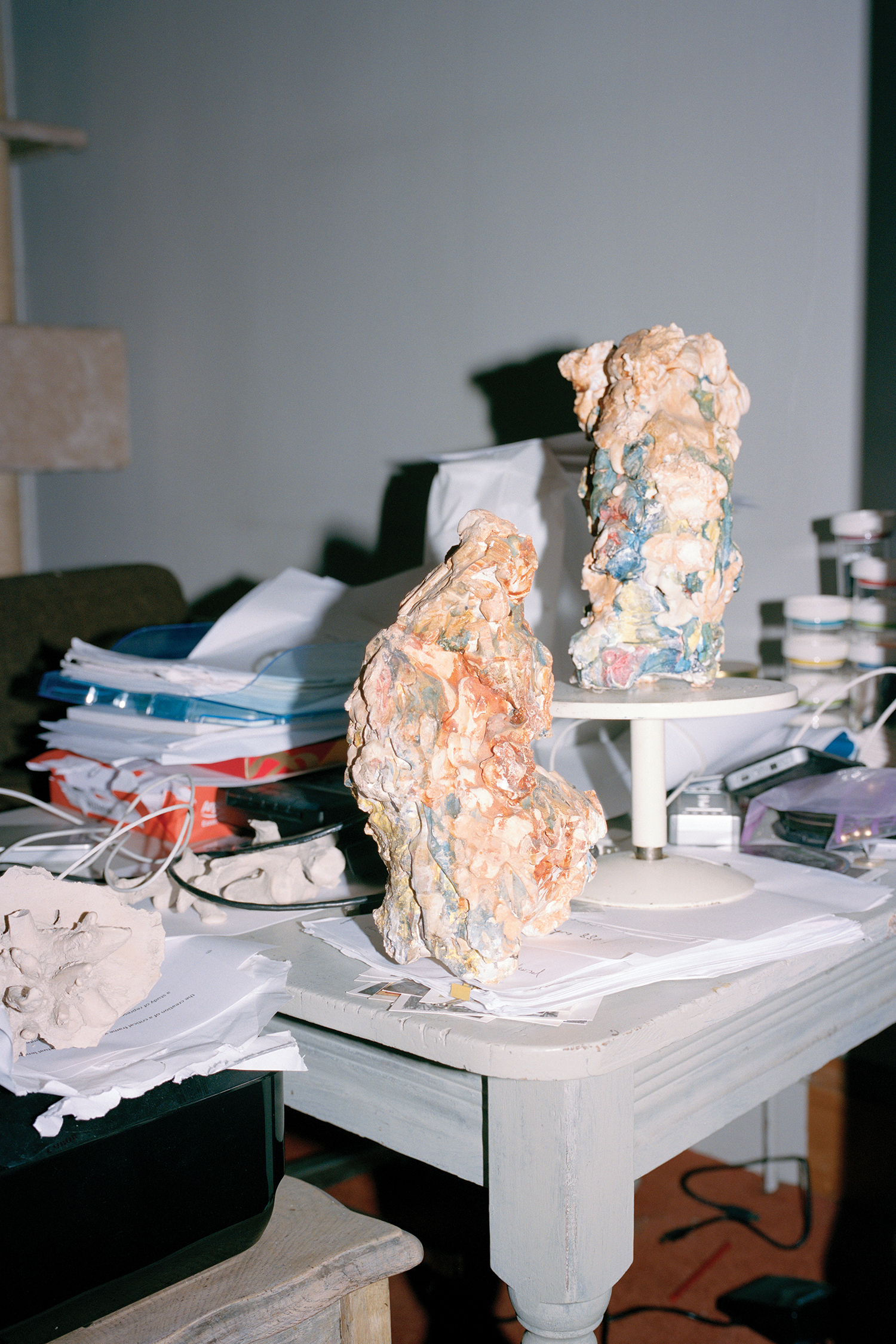
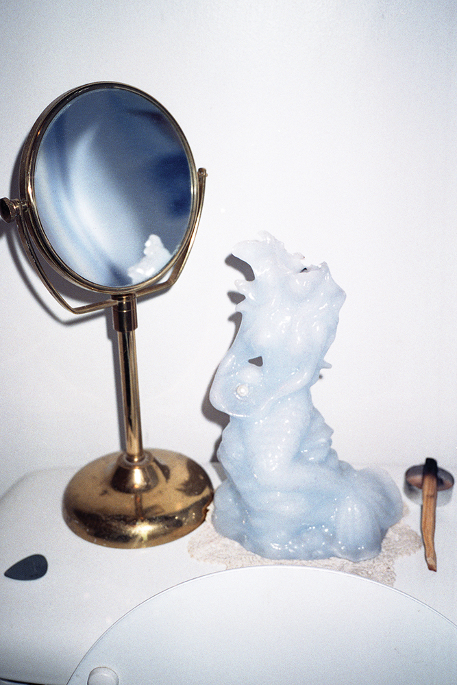

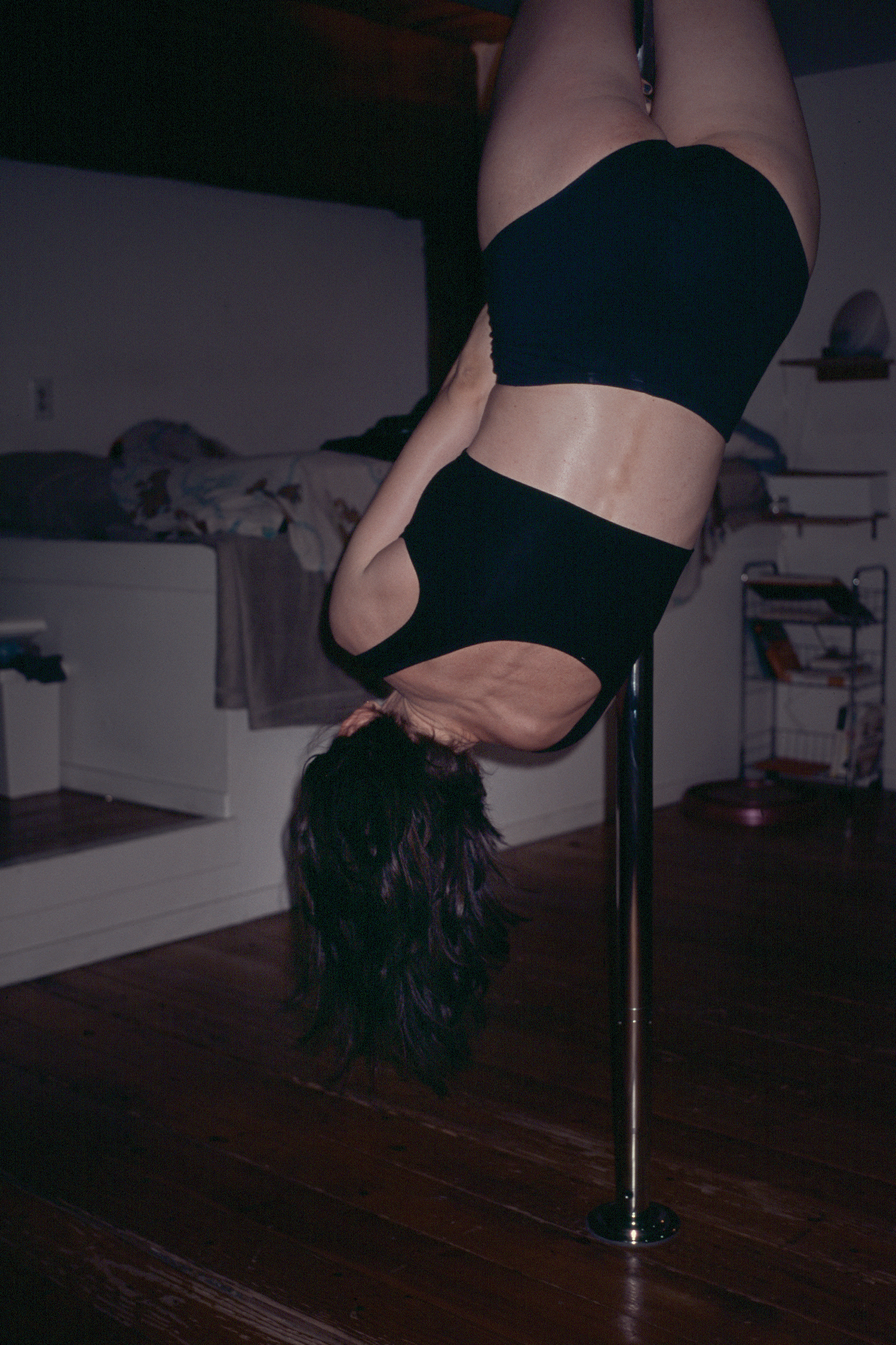

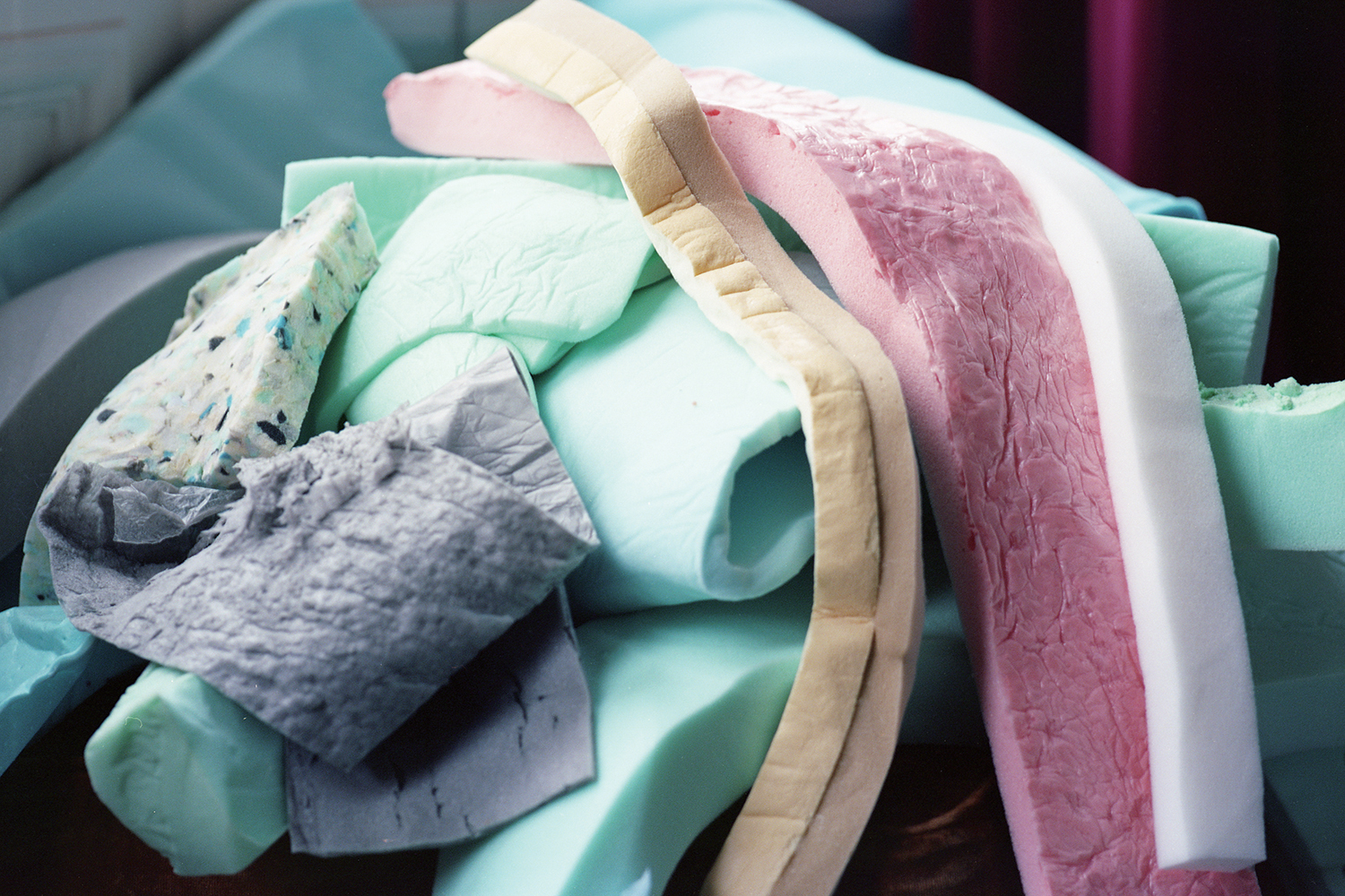
The Vulgarity of Being Three-Dimensional
Jul 05, 2018 - Tine Bek
For my first post I would like to introduce and explain a bit further my ongoing project The Vulgarity of Being Three-Dimensional. To begin with I will be going through some of the actual works, and over the next week I will show you some inspiration and dig a bit in to elements of my sporadic and widespread research. To finish off I will share some tips on publishers and artists that I think are doing amazing and important work.
To explain my train of thought I should mention that although my practice is probably around 99% photographic, I have a tendency of using other elements when starting and understanding new projects. Books, popular culture, gardens and £60 cakes have been part of my early research for this particular project, which seems to still 2 years on, grow arms and legs. It Originated as a piece of work that should be presented in book form, the project has now turned into more of an installation presentations, however in the end it will be a book again, one day.
The Vulgarity of Being Three-Dimensional, takes its title from a line in a short story by the Danish author Karen Blixen as its starting point. Fascinated by Blixen’s use of description, and her incorporation of mood and colour in Carnival, I sought to push my own focus upon tactility, textures, surfaces and their stories toward a more abstract observation of everyday situations and objects.
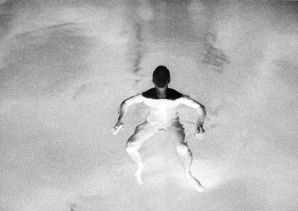
The photographs of The Vulgarity of Being Three-Dimensional explore the relationship between ‘the object and the image’, in particular the sculptural object and its image. The work exhibits a curiosity about that transformation from three-dimensional object to two-dimensional image; about its effect upon the object, and how the difference between an object and its image can be ‘held’ within the photograph.
In some photographs, light is used to emphasise the three-dimensionality and location in space of the photograph’s objects. In others, the particular challenges of three-dimensionality are emphasised; a hand steadies an upright foam ‘obelisk’ in one image, a young woman holds herself aloft on a pole, upside down and at a seemingly impossible angle, in a deceptively effortless defiance of gravity.
The everyday is disrupted by fairy-tale, we are reminded of the deep ambivalence of the looking glass, the dangers of beauty and the painful impossibilities of being loved.
The images are playful and disruptive with clear hints of irrationality and the grotesque, a hint of horror. This fantastical and mischievous approach invites questioning of social structures, reflection upon where reality and pretending begin and end.
Part of the work statement is an extract from a text by Siún Hanrahan for Source Magazine.