

Specials
Specials is a virtual space dedicated to writing on photography, showcasing unique content, projects and announcements.
Grey Crawford @Persons Projects during Gallery Weekend Berlin 2022
Grey Crawford | Chroma Figura 1978-84
Exhibition: 28 April – 25 June 2022
Opening: Friday, 29 April 2022, 6-9 pm
Each spring during Gallery Weekend, Berlin galleries open exhibitions by emerging and established artists, welcoming numerous visitors from around the world to the city.
On this occasion, Persons Projects is proud to present Grey Crawford’s solo exhibition, Chroma Figura, which focuses upon his previously unseen color works from 1978-1984.
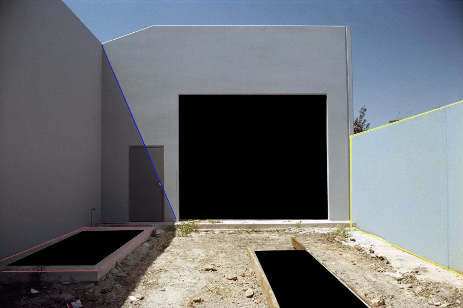
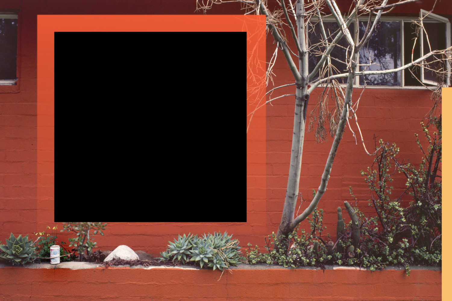
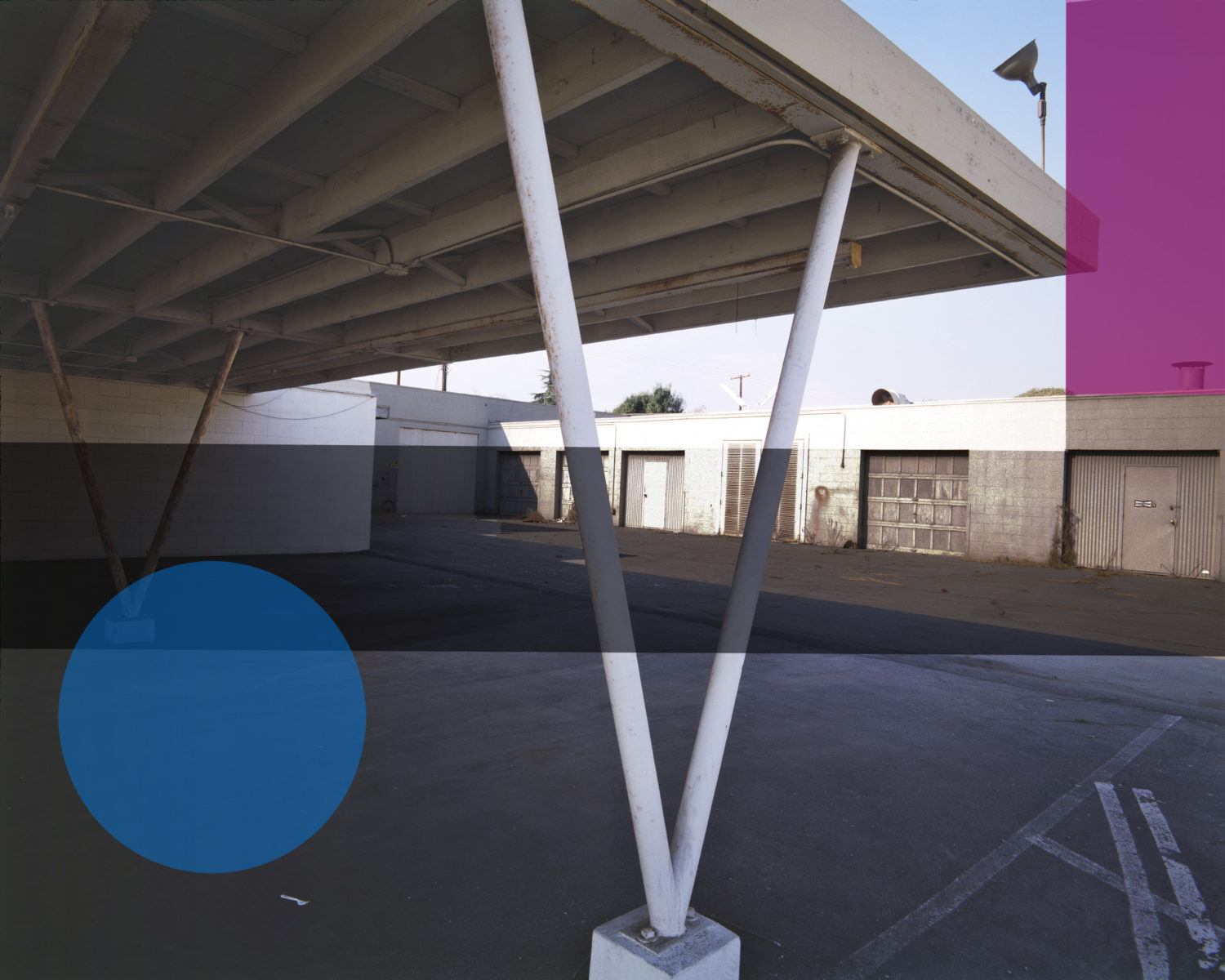
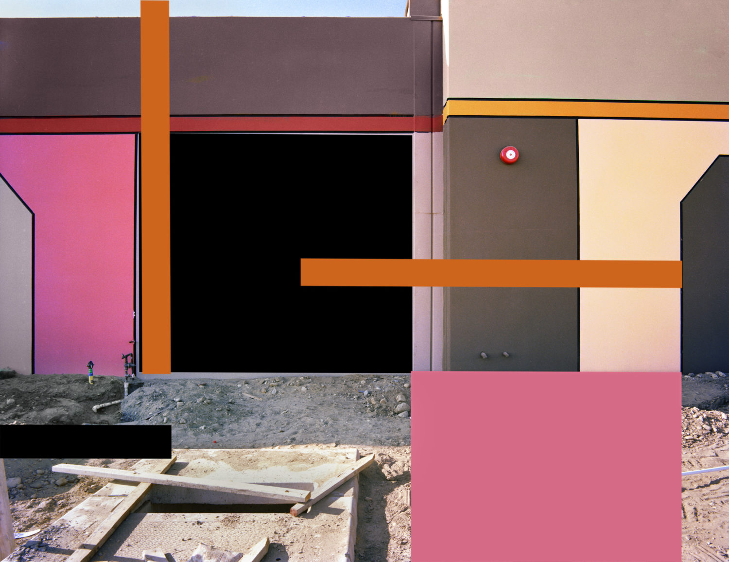
Grey Crawford was born and raised in Southern California, USA, and was one of the first West Coast artists who challenged the photographic medium through his darkroom experiments with both black and white and color photography. Working within LA’s urban landscapes of storage units, gas stations, parking lots, and industrial buildings, Crawford used the ordinary as a backdrop for his photographic documentation to later alter with his darkroom alterations. These experiments transformed the architecture of everyday Southern Californian life into another plane of thinking. By using his own printing techniques of inserted colored geometric shapes along with various lines and gradients on photographic paper, Crawford marks a new chapter in the history of color photography. We are excited to share with you our Q&A featuring the artist!

During Gallery Weekend Berlin, Persons Projects presents your solo exhibition, which introduces the Chroma Figura series from 1978-1984. Can you give us more details on this series?
The series was started in 1978, as I was shifting from the black-and-white of the Umbra series to experimenting with color. There are two parts to the Chroma series, Figura and Fabula. The Figura part of the series is being shown at Persons Projects, representing a continuation from the Umbra black-and-white series where I was using geometric shapes. The shapes of broad color were created with hand masking and filters that I had experimented with in the darkroom, doing everything by hand. The initial experiments and carry over from the Umbra series were easy to replicate. What was new was the experimentation that came in using the colored filters and finding how those filters would represent color in the print. In going from a color negative to color positive print, one must use a color filter which is opposite the color you want. So, for example, to have a yellow on the final print you have to use a blue filter.
Conceptual color photography in the 1970’s was in its infancy. The techniques that you developed in your darkroom were demanding and their outcomes often unknown. Can you describe your experiments and who or what inspired them?
The technique I had developed in Umbra of hand cutting masks and varying exposures to create various densities, was where I started. With the addition of color filters, I was able to produce color geometric shapes on the prints. My inspiration in terms of color was from the abstract painters of Southern California: John McLaughlin and Karl Benjamin. I had grown up as a young man visiting Karl in his studio and watching and seeing him work. And then through Karl, I became aware of John McLaughlin’s work who also lived in Southern California. In terms of the dark room, the negative was projected onto construction paper. I drew the shapes and then cut those shapes out, and then they were positioned next to the enlarger and the overall exposure was made. Then the masking was introduced with color filters to produce the shapes. Sometimes I would remove the color negative, to create a pure light and pure color. Other times I would leave the negative in the enlarger and project through the negative and then through the filter mixing the two light sources to produce a whole new color. The results initially were quite experimental in that I was never sure what I was going to get. It took several months to feel confident and able to produce those final colors that I was looking for. And as time went on, I was able to become more sophisticated with the use of the masks, the filters, creating my own graduated filters, and mixing all of these to produce the work you see in Figura, and even more developed in Fabula.

In seven years, you created more than 200 works. What fuelled your interest in extending the series over the course of time?
As mentioned, there were technical challenges and excitement throughout this process. In a lot of work I try to put technique in the background and work forward with just the concept. In Chroma, concept and technique were married together. The technique had its own life and mixed together informed me as I went along. Each print was a new beginning and taught me something new in technical terms and concepts. Over the period of seven years the technique kept challenging me and showing me new possibilities that, combined with shooting new imagery and learning from what I’ve done before, kept the series very fresh for me over this period of seven years.
You imagined a virtual reality long before the technologists introduced the digital revolution. How do you see your work some forty years later, with digital technology and the virtual world being a part of everyday life?
I am reflecting on how at that time the changing landscape of Southern California and my introduction of painterly abstraction into photography created a new language in which to view the world. The digital technology that we now have, and with which we are experimenting and creating art, reiterates my point of the human active perceptual mode with which to view the world. I was using the reality medium of my time, photography, to create this new language. The key is always the human imagination using new technologies, now with almost infinite possibilities, and creating new worlds, and new visual languages; which I was doing 40 years ago.


The exhibition focuses on previously unseen color works. What awaits the visitors?
The show comprises 11 prints from the Figura series of Chroma. What I find wonderful about the show is that out of the 11 pieces, four are 121 x 151 cm large. In the 70s, I experimented with larger prints. It became uncontrollable and I couldn’t print larger than 40.6 x 50.8.cm. These four large pieces represent to me 40 years later the realization and the feeling of the space that I could only imagine all those years ago.
The exhibition is accompanied by your latest book published by Beam Editions. Can you discuss how you developed the Chroma Figura series as a book?

I met Oliver Wood and Jonathan Casciani at Printed Matter’s Los Angeles book fair in 2019. In viewing their books in Los Angeles and meeting them, I thought these were publishers I would like to work with. We met and talked further at Photo London 2019 and decided to work together on the Chroma books volume one and volume two. We decided to feature in each volume one series out of Chroma, the two series being Figura and Fabula. We had Lyle Rexer write the main essay, just like in my previous two books: Umbra and El Mirage. Hannah Glauner and Ashley Gallant also added essays, with Timothy Persons writing the introduction. Asia Zack Persons, Timothy Persons, Oliver Wood, Jonathan Casciani, and myself were the core group that worked on the editing and layout of the book. We developed five chapters with a technological explanation at the end, with diagrams and a discussion of creating and using the masks, filters, and graduated filters in the color darkroom.
The first chapter is named Geometric Abstraction. It shows my influence from the painters John McLaughlin and Karl Benjamin, and how I brought the language of abstraction into photography using the technically challenging masking process. This technique was highly innovative in the 70s and it had never previously been seen. This combination of imagery and abstraction was creating a fourth dimensional space. Sometimes the shapes were in direct conversation with the architecture and the landscape. At other times, I completely contrasted them, so I felt the work was occupying a space between painting, sculpture, photography, architecture, and photo documentations of land art and light space installations.
The second chapter is called Forms and Lines. In these works, I put the forms in the buildings and the spaces. Grids, diagonals, lines, and blocks created a new architecture in a new space. Some things are working harmoniously and others are in contrast, creating completely new spaces.
The third chapter is named Integration with the Picture Plane. Here, I am inserting elements which are becoming more subtle, and I am working with the original location responding to incidental marks that can be found in the urban landscape: moments of graffiti, the weathering on a wall surface, a fire escape ladder, and reflection of lights. This all becomes part of the visual language.
The fourth chapter called Graduations and Transparency introduces transparency and graduated layers of color as a new part of the language. Light is trapped, it’s controlled, it’s integrated into the image in the darkroom creating a new aesthetic. And some of these graphic forms are integrated into the image in such a way that they are very subtle and appear to be part of the architecture, again creating a new architecture.
The fifth chapter is named Painted Spaces, and we return to where we began, with the plains of color, the angles formed with color, graduations of hue, and the reduction of recognizable architectural detail, bringing forth a new architecture and a new landscape in which to view what was in the 70s and 80s a new landscape of Los Angeles and creating a new landscape in the medium of photography.
At the end we have included the chapter Masking Before Digital, which illustrates and explains the techniques that I was using.